This is a guest post compiled by +Mazino Oyolo Kigho for OgbongeBlog
Blogger default templates on mobile must surely give you a drop down menu pagelist.
This has really made it difficult sometimes for visitors to find your contact page, except they scroll down to the footer if you have added the contact link there.
Google Adsense is another important thing to consider, placing ads below a drop down navigation is a violation of Adsense policy. Therefore, of recent many ads below that spot on blogger mobile view were force to the bottom.
Well, you can eliminate the drop down pagelist on mobile view and let it display the same way it appears on webview. This tutorial will guide you on how to do so.
How To Get Started
Before you get started, please, BACK UP YOUR TEMPLATE so you can easily reverse should in case you mess up your blog's code.
==> Go to "Template" > 'Edit HTML' and search for <b:widget id='PageList1'. Alternatively, you can use the "Jump To Template" option to easily navigate to the PageList1 widget code.
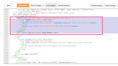
==> Scroll down and look for the following codes :
<select expr:id='data:widget.instanceId + "_select"'>
<b:loop values='data:links' var='link'>
<b:if cond='data:link.isCurrentPage'>
<option expr:value='data:link.href' selected='selected'><data:link.title/></option>
<b:else/>
<option expr:value='data:link.href'><data:link.title/></option>
</b:if>
</b:loop>
</select>
<span class='pagelist-arrow'>&#9660;</span>
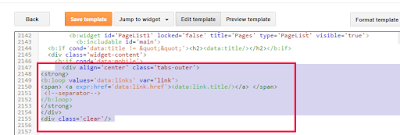
==> Once you find the above codes, replace them with the codes below:
<div align='center' class='tabs-outer'>
<strong>
<b:loop values='data:links' var='link'>
<span> <a expr:href='data:link.href'><data:link.title/></a> </span>
<!--separator-->
</b:loop>
</strong>
</div>
<div class='clear'/>
==> Click "Save Template"
==> Go to "Template" > "Customize" > "Advanced" > "Add CSS"
==> Copy and paste the code below, in the "Add CSS" box
.mobile .tabs-outer {
color: #333;
text-align:center;
width:auto;
overflow:hidden;
margin:0;
padding:0px 0px 0px 0px;
}
.mobile .tabs-outer span a {
color: #fff;
padding:0 7px;
margin:0;
}
.mobile .tabs-outer span a:hover {
text-decoration:none;
color: #fff;
font-size:1.0em;
padding:0 5px;
margin:0;
}
==> Click "Apply To Blog"
That's all.
View your blog on mobile and you should see that the dropdown menu displaying as it does on web view.
What's your take on this?.
This post was written by +Mazino Oyolo Kigho . He blogs on MazinoWeb and you can follow him on Twitter @mazinoweb and add him as friend on Facebook here.
Other guest posts written by Mazino :


Mazino the Great.
ReplyDeleteweldone
Thanks
DeleteCall me Mazino and not Mazino the great.
I am not great.
Well you can share this tutorial with other fellow bloggers.
Thanks for this,,, am gonna try it out.
ReplyDeleteAlright
DeleteNice post and helpful,You really work hard to find a reasonable solutions to people's problems
ReplyDeleteComment from
Must Read: Top 10 Things to Do After Buying New Android Phone
Also Visit
Naijatechviral-Home of Tech,Tricks, Android Tricks ,Tutorials And many more
nawa oh... smh
Deletethanks for this post, its great
ReplyDeleteWow 👍 it cool
ReplyDeleteFrom FLEXYHUBS.COM
i just tried it out on my news blog at www.gistpark.com and it worked perfectly 100 percent. Mazino thanks for this tutorial. Jide thanks for allowing Mazino share this great tip with us all.
ReplyDeleteGood to know it worked for you.
Deletewow. great tutorial. I'm off to try it now , thanks
ReplyDeleteIt worked well in my blog. But everything ,both text and background was white in color, do I had to make some changes in the CSS code you provided. So if yours is the same with mine , just changed one of the color codes from #fff to another color code just like I did in mine.
ReplyDeleteCheckout my blog here to see the sample
Wow it cool and i really like it see my blog secretgist.com/?m=1
ReplyDeleteWow! It worked perfectly... Check my blog TECHGEEZ.COM
ReplyDeleteIt's a very great post and coding but for personal and Google mobile friendliness + readers UI I prefer the drop down. Since it is most recommended for mobile devices.
ReplyDeleteWow, Its Perfect, and Its also SEO Friendly, You can checkout how my blog looks like now, I Blog at ==>> www.naijalads.com.ng
ReplyDeletePlease o! It looks cool,but some of my links are not visible when you view with a smaller screen. Bigger screens on tablets don't have issues. What do I do. You can see it kongonut.com/m=1
ReplyDeletewooow, it worked for me. thanks alot
ReplyDeletei am greatful
ReplyDeleteI would like my own to be dispalying in drop down menu.. just like it was befor in the first screen shot.. pls how do i do it?
ReplyDeleteSame here, I'll like mine to be displaying in drop down rather, please.
ReplyDeletethis article has helped me alot thanks to all the bloggers community i really aprecaite.
ReplyDeleteThanks for sharing a great learning tutorial and i am gonna try it out
ReplyDelete