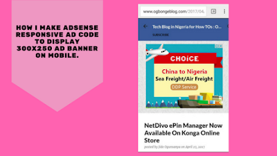
If you discover that your Adsense responsive ad code doesn't display the size of ad banner you would like it to display, you can modify your ad code to meet the requirements of your responsive site. So, instead of your responsive ad code to be displaying 300x100 banner above the fold, you can force it to display 300x250 mobile banner. This of course, is allowed by Google Adsense.
In this tutorial, I want to show you how I modify my responsive ad code to display 300x250 ad banner above the fold on mobile.
Below is what my modified ad code looks like :
<style>
.OBResponsiveTop { width: 300px; height: 250px; }
@media(min-width: 500px) { .OBResponsiveTop { width: 468px; height: 60px; } }
@media(min-width: 800px) { .OBResponsiveTop { width: 728px; height: 90px; } }
</style>
<script async src="//pagead2.googlesyndication.com/pagead/js/adsbygoogle.js"></script>
<div style='display:block;text-align: center'>
<!-- OBResponsiveTop -->
<ins class="adsbygoogle OBResponsiveTop"
style="display:inline-block"
data-ad-client="ca-pub-XXXXXXX11XXX9"
data-ad-slot="7XXXXX1"></ins>
<script>
(adsbygoogle = window.adsbygoogle || []).push({});
</script>
</div>
The code above does these:
To adapt this sample code for your own blog:
1. Create a responsive ad unit in your AdSense account, and note down the following information from your responsive ad code:
2. In the sample code:
3. Copy and paste your modified ad code into your blog's HTML where you'd like the ads to appear.
Once you’ve placed your ad code, test your ads on different devices and screens to make sure that the responsive behavior is working correctly.
That's all.
In this tutorial, I want to show you how I modify my responsive ad code to display 300x250 ad banner above the fold on mobile.
Below is what my modified ad code looks like :
<style>
.OBResponsiveTop { width: 300px; height: 250px; }
@media(min-width: 500px) { .OBResponsiveTop { width: 468px; height: 60px; } }
@media(min-width: 800px) { .OBResponsiveTop { width: 728px; height: 90px; } }
</style>
<script async src="//pagead2.googlesyndication.com/pagead/js/adsbygoogle.js"></script>
<div style='display:block;text-align: center'>
<!-- OBResponsiveTop -->
<ins class="adsbygoogle OBResponsiveTop"
style="display:inline-block"
data-ad-client="ca-pub-XXXXXXX11XXX9"
data-ad-slot="7XXXXX1"></ins>
<script>
(adsbygoogle = window.adsbygoogle || []).push({});
</script>
</div>
The code above does these:
- For screen widths up to 500px: a 300x250 ad unit is displayed.
- For screen widths between 500px and 799px: a 468x60 ad unit is displayed.
- For screen widths of 800px and wider: a 728x90 ad unit is displayed.
- and the displayed ad unit displays at the center.
To adapt this sample code for your own blog:
1. Create a responsive ad unit in your AdSense account, and note down the following information from your responsive ad code:
- Your publisher ID, for example, ca-pub-1234567891234567
- Your ad unit's ID (data-ad-slot), for example, 1234567890.
2. In the sample code:
- Replace all instances of OBResponsiveTop with a unique name, e.g. front_page_123, etc.
- Replace ca-pub-XXXXXXX11XXX9 with your own publisher ID.
- Replace 7XXXXX1 with your own ad unit's ID.
3. Copy and paste your modified ad code into your blog's HTML where you'd like the ads to appear.
Once you’ve placed your ad code, test your ads on different devices and screens to make sure that the responsive behavior is working correctly.
That's all.


AdSense improving every day.... Boss my e-mail reply ooo
ReplyDeleteUuchidiebere@gmail.com
Nice tips. Will try it. Check out my blog and tell me whats up www.odiboapeter.com
ReplyDeleteThank you boss
ReplyDeleteHow I caught her cheating
thank you for this great information
ReplyDeletewow.. very helpful, thanks sir.... Commenting from SAFAXNET BLOG
ReplyDeletePlease, I want to edit the mobile width of my blogger site, because if I place AdSense 336x280 inside post, it doesn't show fully on mobile screen. So I want to edit the mobile inside post body width to match the ad size. Please tell me which code to edit to achieve this in my template, thanks.
ReplyDeleteI was able to do it as well. Thanks for your help Mr jide. From Pegikrol
ReplyDeleteWow. Interesting and it does work. Thank you for the trick.
ReplyDeleteplease i have been trying this on my website. please what could i be doing wrong. i followed it just the exact way you tutored
ReplyDelete